***What Are You Smoking, July 2023?***
- Thread starter JimInks
- Start date
You are using an out of date browser. It may not display this or other websites correctly.
You should upgrade or use an alternative browser.
You should upgrade or use an alternative browser.
SmokingPipes.com Updates
Watch for Updates Twice a Week
- Status
- Not open for further replies.
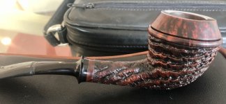
Oriental Silk in a Savinelli Seta 606 KS.
A
AroEnglish
Guest
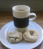
That tea (and biscotti) sounds very tasty. I don’t think we have condensed milk in the house but I’ll grab some from the store.A short break for a mug of milky chai a la the sub-continent (ie very strong and sweetened with a dollop of condensed milk) and a couple of biscotti
View attachment 232049
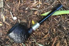
Then onto another bowl of
MacBaren’s HH Arcadian Perique
This time in an I.B.Loran shape 2 Stack
View attachment 232050View attachment 232051
Growing up in Malaysia where fresh milk was not so commonplace, condensed or evaporated milk was the default.That tea (and biscotti) sounds very tasty. I don’t think we have condensed milk in the house but I’ll grab some from the store.
It gives a much “richer/creamier” flavour which you don’t get with fresh milk or cream
It makes instant/granulated coffee a lot more palatable
HOT DAMN! Sweet pipe indeed! While reading your post I was thinking "no - you didn't!" anticipating you were going to say you just went and bot both!
Yeah @TheIronMonkey, why didn’t you buy both? I thought you were cool…
Where do you see these super limited Savs? I don’t think I’ve seen them on SP; are they just on Savinelli’s website? And how did you fall in love with Savinelli in the first place?
LOL! That’s not a stretch of the realm of possibility with me—there have been times in the past with a book or toy that I’ve taken the “when in doubt, buy both” approach. It was mainly a budgetary concern at the time that I just didn’t pull the trigger on the 904 KS. But, the chunkier shaping of the newer 904 did give me pause—I think I’d prefer a ’70s version in terms of aesthetics. When the 904 KS sold and wasn’t on the site, I still didn’t have the disposable income for the 920 KS. When that disappeared, I assumed it was sold not to be seen again. When these two pipes were no longer available, that’s when I felt that pang, “Oh man, I really should’ve just grabbed at least one of them when I had the chance—I’ll never see those again.” You can imagine my shock and surprise when the 920 KS got relisted. I contacted my friend at Savinelli and reserved it immediately. I wasn’t going to pass up on the gift of getting a second chance at something I regretted not getting.
Savinelli’s own website lists a lot of stuff that is available nowhere else. I check there often. Around Easter, they had a couple of egg shaped pipes with removable briar magnetic domes that were really cool. They were gone within a day or two.
Apart from appreciating the long history of the company, I love the aesthetic of a good number of Savinelli shapes (they have their share of shapes that hold no appeal for me, but that’s true of any marque). The 601 and 606 kind of define what I think of in terms of a classic Bent Billiard. I love the 320 Author shape. I enjoy the variations of finish available on a lot of the pipes. The Corallo di Mare is such a weird, organic rustication that I find fascinating and oddly beautiful; the same is true of the Estella finish. These two finishes are especially interesting when looked at side by side next to the “normal” version. With my Ross Macdonald book collection, I started out buying paperbacks to read. I’d come across the same title from different decades with completely different designs and would buy them—the ’50s paperbacks had cool, painted illustrated covers; the ’60s versions had photographic ones; the ’70s had typographic-centric designs. Same book, but vastly different and cool covers. I talked about this in an interview I did with the Library of America back in 2016 with regard to a coffee table book that I designed that was illustrated with my personal book collection. Link here.
A
AroEnglish
Guest
Makes sense! Though my family members in Asia love their instant coffee and some actually prefer it to regular coffeeGrowing up in Malaysia where fresh milk was not so commonplace, condensed or evaporated milk was the default.
It gives a much “richer/creamier” flavour which you don’t get with fresh milk or cream
It makes instant/granulated coffee a lot more palatable
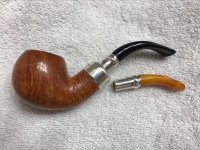
Three Friars in a Mastro Geppetto Rusticato Naturale bent brandy.
A
AroEnglish
Guest
Thanks for sharing your story about the pipes, interest in Savinelli, and the interview you did (I’ve got it saved in Pocket for later). I haven’t heard about Ross Macdonald until now; which of his books would you recommend starting with?LOL! That’s not a stretch of the realm of possibility with me—there have been times in the past with a book or toy that I’ve taken the “when in doubt, buy both” approach. It was mainly a budgetary concern at the time that I just didn’t pull the trigger on the 904 KS. But, the chunkier shaping of the newer 904 did give me pause—I think I’d prefer a ’70s version in terms of aesthetics. When the 904 KS sold and wasn’t on the site, I still didn’t have the disposable income for the 920 KS. When that disappeared, I assumed it was sold not to be seen again. When these two pipes were no longer available, that’s when I felt that pang, “Oh man, I really should’ve just grabbed at least one of them when I had the chance—I’ll never see those again.” You can imagine my shock and surprise when the 920 KS got relisted. I contacted my friend at Savinelli and reserved it immediately. I wasn’t going to pass up on the gift of getting a second chance at something I regretted not getting.
Savinelli’s own website lists a lot of stuff that is available nowhere else. I check there often. Around Easter, they had a couple of egg shaped pipes with removable briar magnetic domes that were really cool. They were gone within a day or two.
Apart from appreciating the long history of the company, I love the aesthetic of a good number of Savinelli shapes (they have their share of shapes that hold no appeal for me, but that’s true of any marque). The 601 and 606 kind of define what I think of in terms of a classic Bent Billiard. I love the 320 Author shape. I enjoy the variations of finish available on a lot of the pipes. The Corallo di Mare is such a weird, organic rustication that I find fascinating and oddly beautiful; the same is true of the Estella finish. These two finishes are especially interesting when looked at side by side next to the “normal” version. With my Ross Macdonald book collection, I started out buying paperbacks to read. I’d come across the same title from different decades with completely different designs and would buy them—the ’50s paperbacks had cool, painted illustrated covers; the ’60s versions had photographic ones; the ’70s had typographic-centric designs. Same book, but vastly different and cool covers. I talked about this in an interview I did with the Library of America back in 2016 with regard to a coffee table book that I designed that was illustrated with my personal book collection. Link here.
Thanks for sharing your story about the pipes, interest in Savinelli, and the interview you did (I’ve got it saved in Pocket for later). I haven’t heard about Ross Macdonald until now; which of his books would you recommend starting with?
I love The Galton Case, but a better book for a newcomer to his work is probably The Chill—it’s a much loved and revered book in the mystery/detective fiction genre, and with good reason.
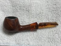
Almost a third of the way through this bowl of year 2014 Edgeworth Ready Rubbed Match in a late '80s, early 90s small bend medium brown smooth, unbranded Nording pot with a couple small rusticated spots, an amber colored acrylic ferrule and tapered stem in the military mount style. Had to separate Tomato the Brave from Abner the Eager so they could both eat in peace. They are starting to not dislike each other as much as they did, so a little progress is slowly being made. Abner's not the problem. He wants to get along with everybody. Tomato doesn't like competition. Daisy the Feral Princess ate earlier, so she's sleeping off a big meal.

- Status
- Not open for further replies.


