Logos Matter
- Thread starter vosBghos
- Start date
You are using an out of date browser. It may not display this or other websites correctly.
You should upgrade or use an alternative browser.
You should upgrade or use an alternative browser.
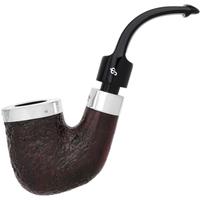
The "S"s and "P"s on my pipes have worn away after 40 years or so.
I'm sure that happens with other pipe logos.
I'm sure that happens with other pipe logos.
Don’t show that to Sigourney Weaver!
Precisely this it cheapens the look significantly
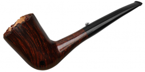
You want to talk about making things look cheap, I personally think the name stamped in Black letters on the shank makes this pipe look cheaper than the logo on the steam.
Nice looking grain on a pipe, with awful black letters, what were they thinking, who knows, but this is clearly distasteful, and someone who lacks class, that came up with this bright idea. LOL ?
Black lettering is not something commonly seen, nor have I ever seen black letters on expensive pipes.
Rattray's Nimbus Light Smooth (9mm) | Buy Rattray's Tobacco Pipes at Smokingpipes.com
Smokingpipes.com is your one stop shop for Rattray's Nimbus Light Smooth (9mm) Tobacco Pipes and all your tobacco smoking needs. From new tobacco pipes and estate tobacco pipes to tin pipe tobacco and bulk pipe tobacco, we have everything you need
Now, for the few pipes I’ve seen black letters stamped on them, I wasn’t interested in owning, as someone wanting to not only smoke pipes, but collect them.
P.S. If this was my company, I would of simply come up with a nice looking R to stamp on the stem.
Last edited:
Pipe smokers rarely agree on anything.
I disagree.
The black lettering makes it look a lot worse, it really stands out. I could deal with that logo if it wasn't blackened.Nice looking grain on a pipe, with awful black letters, what were they thinking,
That's funny! The Triskele (Rattray's logo) is what made me buy a Rattray pipe! I'm in utter love with anything Irish or Celtic, and I needed that pipe especially because of the logo.Sadly Rattray’s , it looks like something 90’s raver girl would want tattooed on her shoulder, if it was embossed and small I’d get it but all big and wonky in gold on the shank it’s too overpowering I couldn’t look at that. Luckily they do have models that are more tasteful but I passed on a few fore sure. I do some graphic design gigs here and there so it’s like taking work with me when I want to relax I don’t want to see aggressive logos…
But I completely understand that it can be something any kid would made a tattoo of, like tribal lines!
Bottom line is.. Logos are bullshit.
Agreed, ethos is what should be considered.


