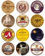
Very cool, gonna be printing a few Devil’s Holiday, and more as my collection grows (may try blends to match labels )
)
Swiss Army Knife's Jar Labels
- Thread starter Swiss Army Knife
- Start date
You are using an out of date browser. It may not display this or other websites correctly.
You should upgrade or use an alternative browser.
You should upgrade or use an alternative browser.
These are beautiful.View attachment 147254
View attachment 147255
Well here it is, my pride and joy the Rattray's labels. This is the culmination of two and a half months in spare time and I'm really happy with how it turned out. For those of you who are big Rattray's fans I hope you enjoy!
A Little Background...
Like all my labels these started when I bought a tin of something, I happened to snag a few tins of Old Gowrie, HOTW and Marlin Flake off the good folks at MarsCigars. I was looking at the standard Rattray's round tins and trying to think up a way to spice them up a bit. I really like Rattray's branding but those round 50g tins just seemed so plain. At some point I was googling what Gowrie meant, it's the area in Scotland around Perth. This got me thinking it would be fun to combine each blend with the heraldic crest of different cities and towns in Scotland.
Old Gowrie was the test bed, mainly because it was really clear what area it's crest should be and that Perth had an really fantastic Agnus Dei style design. It took a while but when Gowrie was done I wanted to sprint through the rest, however I needed to figure out where all these blends were going to go first. So I made a big map...
View attachment 147257
There were a couple of themes, if a blend had a number in it and not much else to go on I'd try and match it with a fitting crest. All the flake tobaccos I wanted to match with harbor towns/ship crests. The rest was either historically based or on a whim. I go into detail for each blend my reasoning down below if you're interested.
I need to take the time to credit a few communities that were instrumental in this process. The first is the fantastic Heraldry Wiki, it's a huge repository of heraldic images and background information. Their section on the old Kaffee HAG stamp collection books was a really great resource, especially the British Isles page. I've also got to credit the amazing folks at Wappen Wiki. They're a small community that's categorizing and standardizing just about every piece of heraldry they can find. A lot of their stuff served as the basis for the designs here, all with a generous creative commons noncommercial license to boot.
Now Onto The Labels
This may be a somewhat nontraditional way to group these, but in all my organizational documents I try and keep the number of categories to a minimum. As in I don't want to have seperate categories for Virginias, VaPers, VaKy, VaKyPer or the myriad English blend types. So it's grouped into Virginia heavy blends, blends with any real Latakia in them, obvious Aromatics, and Burleys kind of serve as a catch all for anything that doesn't fit in Virginias and has a decent amount of Burley. So without further ado...
Virginias
View attachment 147253
40 Virginias | Elie and Earlsferry: 40 Virginias clearly gets the Elie and Earlsferry crest because it's four ships. Not really stretching the imagination I know, but it feels fitting with Virginia's ties to historical navies.
Black Virginia | Dunfermline: I think it was the bed of dark earth at the bottom of this lion flanked tower, but there was something that just called to me when matching Black Virginia.
Brown Clunee | Auchterarder: Brown Clunee was originally going to be Falkland which has a brown deer laying in front of a tree on a hill all in true color. I think the brown deer=brown clunee was what made me go with that. However after smoking the stuff it's punchy, peppery spice made me reevaluate and give it a much feistier falcon crest instead.
Dark Fragrant | Coatbridge: The combination of the unusual dark background and flame spewing top had me quickly associating it with Dark Fragrant's black cav and perique.
Hal O' The Wynd | Jedburgh: This was a really fun one to do. Hal O' The Wynd is named after the blacksmith character in The Fair Maid of Perth and he's supposedly a great smith and soldier. In my head I imagined him having retired to Perth after serving in the famous Scottish Border Riders, this tin commemorating his youthful days.
Marlin Flake | Stranraer: The first of the Flakes = Ship theme. Marlin Flake seemed appropriate for this one, it's a strong tall classical ship but in an otherwise fairly run of the mill color scheme. Felt fitting to me and my experience with Marlin.
Old Gowrie | Perth: The one that started the whole thing, like I said earlier, this one was easy. Perth is a natural fit and the Agnus Dei lamb really struck a chord with me. Possibly my favorite of all of these.
CellarLabels | Google Drive
Latakias
View attachment 147251
3 Noggins | Aberdeen: It's a little silly but seeing 3 Noggins and these castles I couldn't help but think hard noggin = castle and there's three of them!
7 Reserve | Fraserburgh: Another number themed crest. This time it's six flowers and two lines, with one crossed out leaving seven.
Accountant's Mixture | Kilmarnock: For Rattray's "All-Day" Englishes I wanted to go with crests that were a little simpler, something without a lot of frills and would fit with these go to but otherwise fairly straightforward blends.
Black Mallory | Edinburgh: Truth be told I think it was the Black in Black Mallory that had me pairing it with Edinburgh intimidating black castle. Still it's felt right seeing as it's one Scotlands great cities and Mallory is one of Rattray's great blends.
Highland Targe | Dingwall: Highland Targe is one of the blends that kind of hopped around for a while. Obviously I wanted it's crest to be somewhere in the highlands but unsurprisingly there's not a lot of major towns or cities up there. At least few with heraldry that felt appropriate, but Dingwall's fairly unique sun caught my eye especially when I noticed it looked like a small Targe.
Jock's Mixture | Falkirk: Of the "All-Day" blends I've always thought of Jock's as the punchiest, so it got the punchier of the more basic crests. The swords and shields were a bonus.
Professional Mixture | Annan: The last of the "All-Day" Englishes, it again recieves a fairly basic design.
Red Lion | Scotland: A pretty self explanatory one. There really couldn't be any other crest than the Royal Banner of Scotland for Red Lion.
Red Rapparee | Hamilton: Aside from the Red connection I think I picked this one because of the flowers. Maybe it was old memories of the Scarlet Pimpernel but I really gravitated towards this crest for a blend named after 17th century Scottish highwaymen.
CellarLabels | Google Drive
Burleys
View attachment 147250
Macbeth | Alyth: Did the real life MacBeth ever live in a castle near Alyth? Well no, but the fictional one did! Plus you can't get much better than the great Scottish king of Shakespearean myth paired with a crowned red lion.
Stirling Flake | Caithness: More Flake=Ship combo, the dark raven seemed fitting for Stirling's strong DFK.
Wallace Flake | Renfrew: This one seemed meant to be, Renfrew is the supposed birthplace of the legendary William Wallace. Plus, it's a ship and a flake!
CellarLabels | Google Drive
@Swiss Army Knife I'm around 3 months into pipe smoking and wow, these are an amazing find. Your design skills are incredible. Thanks for taking the time to create clean, vector images... and not only upload them for free, but also expain some of your thought processes behind it. Love that.
Have you made any since your last update (Nov 2022)? Just checking in! Sorry to revive an old thread but this is so worth it. Thank you again for letting organization-lovers like myself enjoy this like a true hobby!
Have you made any since your last update (Nov 2022)? Just checking in! Sorry to revive an old thread but this is so worth it. Thank you again for letting organization-lovers like myself enjoy this like a true hobby!
Thanks so much, I'm always really glad people can get some use out of them.@Swiss Army Knife I'm around 3 months into pipe smoking and wow, these are an amazing find. Your design skills are incredible. Thanks for taking the time to create clean, vector images... and not only upload them for free, but also expain some of your thought processes behind it. Love that.
Have you made any since your last update (Nov 2022)? Just checking in! Sorry to revive an old thread but this is so worth it. Thank you again for letting organization-lovers like myself enjoy this like a true hobby!
I haven't unfortunately, it's been a busy year and some change. That plus I switched to using more Mylar bags and less jars due to travel. In last few months I've settled more and have been using jars again. So I've got WAY too many naked jars right now and I've been getting the itch again.
Thanks so much, I'm always really glad people can get some use out of them.
I haven't unfortunately, it's been a busy year and some change. That plus I switched to using more Mylar bags and less jars due to travel. In last few months I've settled more and have been using jars again. So I've got WAY too many naked jars right now and I've been getting the itch again.
I totally get it! What program do you use? Adobe? Illustrator? I ask because when I download and see these images up close, these are vector images. You basically re-drew all the designs yourself
Most people are photographing tin labels or downloading an image off of retailer websites, cropping them into circles, and then printing them. On the other hand, there's you: I assume you are doing the same but then you're using Photoshop/Illustrator to convert them into vector images. It's brilliant and your images are so crisp and clean.
Yeah it's primarily Adobe Illustrator. The vast majority of the time it's hand making everything, Illustrator does have a convert to vector tool but it's not very accurate.I totally get it! What program do you use? Adobe? Illustrator? I ask because when I download and see these images up close, these are vector images. You basically re-drew all the designs yourself
Most people are photographing tin labels or downloading an image off of retailer websites, cropping them into circles, and then printing them. On the other hand, there's you: I assume you are doing the same but then you're using Photoshop/Illustrator to convert them into vector images. It's brilliant and your images are so crisp and clean.
For 2x2" jar labels that's beyond overkill but it's a hobby thing me more than anything else.
I love finding ppl who are really good at their craft. You can definitely tell you put time into doing this.Yeah it's primarily Adobe Illustrator. The vast majority of the time it's hand making everything, Illustrator does have a convert to vector tool but it's not very accurate.
For 2x2" jar labels that's beyond overkill but it's a hobby thing me more than anything else.
I want to make more myself, but I forgot how to use Ilustrator (I used to be in graphic design in the 2000s but now I'm so far removed from that industry that I have no idea how to navigate most Creative Cloud products now lol. Uh would you by chance be willing to share screen one day for a stranger and let me just observe you converting a photo into a vector image? I'd gift you some samples of whatever I've got! Totally fine to say hail no, of course and I'll just YouTube it
I don't know if I'd be able to do all that but I can definitely give you a good, cheap and easy starting point. Especially if you're already familiar with how something like Illustrator works on a base level:I love finding ppl who are really good at their craft. You can definitely tell you put time into doing this.
I want to make more myself, but I forgot how to use Ilustrator (I used to be in graphic design in the 2000s but now I'm so far removed from that industry that I have no idea how to navigate most Creative Cloud products now lol. Uh would you by chance be willing to share screen one day for a stranger and let me just observe you converting a photo into a vector image? I'd gift you some samples of whatever I've got! Totally fine to say hail no, of course and I'll just YouTube it
Firstly I'd avoid using illustrator unless you're happy paying Adobe's subscription fees. Affinity Designer is a very similar program built to be a competitor to Illustrator but with a one time purchase fee.
From there, find a decent image of a label you want to vectorize. Lock it so it doesn't get dragged around. And then use the pen tool for precise shapes or the pencil tool for freehand shapes. Different designs lend themselves to either option. For example Devil's Holiday was done almost entirely freehand using the pencil tool. It'll probably take a little bit of practice but you can very quickly start cranking things out just using the above.
If you do make something be sure to share it!
This is awesome. Many thanks for the tips. I'll combine this with some YouTube tutorials and hopefully make some things on par with yours. Thanks for the tip on Affinity Designer. Also came across Inkscape. Will compare the three. Will definitely share labels soon enough!!I don't know if I'd be able to do all that but I can definitely give you a good, cheap and easy starting point. Especially if you're already familiar with how something like Illustrator works on a base level:
Firstly I'd avoid using illustrator unless you're happy paying Adobe's subscription fees. Affinity Designer is a very similar program built to be a competitor to Illustrator but with a one time purchase fee.
From there, find a decent image of a label you want to vectorize. Lock it so it doesn't get dragged around. And then use the pen tool for precise shapes or the pencil tool for freehand shapes. Different designs lend themselves to either option. For example Devil's Holiday was done almost entirely freehand using the pencil tool. It'll probably take a little bit of practice but you can very quickly start cranking things out just using the above.
If you do make something be sure to share it!


