
These are amazing! My labels are all 1/2 worn off sharpie. You are an artist!
Swiss Army Knife's Jar Labels
- Thread starter Swiss Army Knife
- Start date
You are using an out of date browser. It may not display this or other websites correctly.
You should upgrade or use an alternative browser.
You should upgrade or use an alternative browser.

SmokingPipes.com Updates
Watch for Updates Twice a Week
PipesMagazine Approved Sponsor

PipesMagazine Approved Sponsor

PipesMagazine Approved Sponsor
PipesMagazine Approved Sponsor
PipesMagazine Approved Sponsor
I don't know about that timeframe since I wasn't in the hobby then, but there was recently (well, several months back now) a similar discussion regarding Cellar Labels and IP/copyright/etc.Didn't someone do this like, 4-5 years back an get a lot of IP flak for it on the forum?
Have we all mellowed out since then?
I can't find anything like that through the search so I'll leave it to a Lifer who remembers.Didn't someone do this like, 4-5 years back an get a lot of IP flak for it on the forum?
Have we all mellowed out since then?
I could see it being an issue for the recreated labels like Devil's Holiday or Mac Baren. But the original designs like the Sutliff ones would be more of a grey area.
I'm fine if PM wants to avoid liability and wants to nuke the thread. Better safe than sorry, but in my time I haven't seen unofficial branded designs posted online by designers or free user made labels for home printing and use face any kind of legal scrutiny.
Really it's up to the boys upstairs.
@jpmcwjr
Wow, the thread that I was thinking about based on your post was over thee years ago, not the "several months" that I had previously stated!Didn't someone do this like, 4-5 years back an get a lot of IP flak for it on the forum?
Have we all mellowed out since then?
cellarlabels.com :: General Pipe Smoking Discussion
cellarlabels.com Do any of you use these? As someone who really enjoys tin art I look forward to seeing these on jars in my stash. They will certainly be quite an improvement over my sharpie chicken scratch on blue masking tape. Here's a few examples.
pipesmagazine.com
Really stunning! I could see me buying some of these tobaccos just so I could use your labels for them 

Yeah, that's the thread I was remembering. The objections, which I didn't agree with but differed on because the legal argument is beyond me, were surprisingly strong.
I'm not trying to stir up trouble for you, just curious about the change. If this is a real issue or just a hobby horse for a handful not no-longer active members.
I'm not trying to stir up trouble for you, just curious about the change. If this is a real issue or just a hobby horse for a handful not no-longer active members.
Hot off the presses we've got the Mac Baren HH series including soon forgotten oldies like Acadian Perique, Vintage Syrian and Highland Blend. From what I could piece together there were some older limited editions like Old Dark Fired Plug, figured it wasn't worth the trouble but if anyone actually has any and wants a label for it let me know.
Mac Baren HH Series

CellarLabels | Google Drive
Gawith Hoggarth Series
I've got a handful of Gawith Hoggarth & Co. Ltd. blends done, as usual it's the ones I've acquired. The illustrations I used as a recolored and faint background were ones I pulled off Google Images forever ago, most of which were watercolor paintings done by Tolkien. The recent discussion of copyright issues made me realize it's best not to share those publically, again I made these for my own personal use so I didn't consider it at the time. There's myriad options for free-to-use old illustrations I can use instead, so I'll be switching all of those out and redoing them. As such the Gawith blends won't make this release like I'd planned unfortunately.
As recompense have this Peterson 3P's label I made with a very ominous Thinking Man in the background.
Peterson 3P's Peterson Perfect Plug

CellarLabels | Google Drive
Currently 3P's is the only Peterson tobacco, Dunhill rebrands excluded, I own so it's the only label for them I've done. I think it could work for other blends they produce but that big square '3P's' is a much better element than, say, Old Dublin would be just right aligned by itself. Usually centered right-aligned text like that can be troublesome on round designs. Especially if the name of the tobacco is one long word, the GLP Embarcadero label I shared earlier is a great example of this. I don't know, I think I just feel kind of uninspired when it comes to Peterson Tobaccos despite really liking their branding.
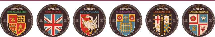
Next time will be the big Rattray's debut.
Mac Baren HH Series
CellarLabels | Google Drive
Gawith Hoggarth Series
I've got a handful of Gawith Hoggarth & Co. Ltd. blends done, as usual it's the ones I've acquired. The illustrations I used as a recolored and faint background were ones I pulled off Google Images forever ago, most of which were watercolor paintings done by Tolkien. The recent discussion of copyright issues made me realize it's best not to share those publically, again I made these for my own personal use so I didn't consider it at the time. There's myriad options for free-to-use old illustrations I can use instead, so I'll be switching all of those out and redoing them. As such the Gawith blends won't make this release like I'd planned unfortunately.
As recompense have this Peterson 3P's label I made with a very ominous Thinking Man in the background.
Peterson 3P's Peterson Perfect Plug
CellarLabels | Google Drive
Currently 3P's is the only Peterson tobacco, Dunhill rebrands excluded, I own so it's the only label for them I've done. I think it could work for other blends they produce but that big square '3P's' is a much better element than, say, Old Dublin would be just right aligned by itself. Usually centered right-aligned text like that can be troublesome on round designs. Especially if the name of the tobacco is one long word, the GLP Embarcadero label I shared earlier is a great example of this. I don't know, I think I just feel kind of uninspired when it comes to Peterson Tobaccos despite really liking their branding.
Next time will be the big Rattray's debut.


Well here it is, my pride and joy the Rattray's labels. This is the culmination of two and a half months in spare time and I'm really happy with how it turned out. For those of you who are big Rattray's fans I hope you enjoy!
A Little Background...
Like all my labels these started when I bought a tin of something, I happened to snag a few tins of Old Gowrie, HOTW and Marlin Flake off the good folks at MarsCigars. I was looking at the standard Rattray's round tins and trying to think up a way to spice them up a bit. I really like Rattray's branding but those round 50g tins just seemed so plain. At some point I was googling what Gowrie meant, it's the area in Scotland around Perth. This got me thinking it would be fun to combine each blend with the heraldic crest of different cities and towns in Scotland.
Old Gowrie was the test bed, mainly because it was really clear what area it's crest should be and that Perth had an really fantastic Agnus Dei style design. It took a while but when Gowrie was done I wanted to sprint through the rest, however I needed to figure out where all these blends were going to go first. So I made a big map...

There were a couple of themes, if a blend had a number in it and not much else to go on I'd try and match it with a fitting crest. All the flake tobaccos I wanted to match with harbor towns/ship crests. The rest was either historically based or on a whim. I go into detail for each blend my reasoning down below if you're interested.
I need to take the time to credit a few communities that were instrumental in this process. The first is the fantastic Heraldry Wiki, it's a huge repository of heraldic images and background information. Their section on the old Kaffee HAG stamp collection books was a really great resource, especially the British Isles page. I've also got to credit the amazing folks at Wappen Wiki. They're a small community that's categorizing and standardizing just about every piece of heraldry they can find. A lot of their stuff served as the basis for the designs here, all with a generous creative commons noncommercial license to boot.
Now Onto The Labels
This may be a somewhat nontraditional way to group these, but in all my organizational documents I try and keep the number of categories to a minimum. As in I don't want to have seperate categories for Virginias, VaPers, VaKy, VaKyPer or the myriad English blend types. So it's grouped into Virginia heavy blends, blends with any real Latakia in them, obvious Aromatics, and Burleys kind of serve as a catch all for anything that doesn't fit in Virginias and has a decent amount of Burley. So without further ado...
Virginias

40 Virginias | Elie and Earlsferry: 40 Virginias clearly gets the Elie and Earlsferry crest because it's four ships. Not really stretching the imagination I know, but it feels fitting with Virginia's ties to historical navies.
Black Virginia | Dunfermline: I think it was the bed of dark earth at the bottom of this lion flanked tower, but there was something that just called to me when matching Black Virginia.
Brown Clunee | Auchterarder: Brown Clunee was originally going to be Falkland which has a brown deer laying in front of a tree on a hill all in true color. I think the brown deer=brown clunee was what made me go with that. However after smoking the stuff it's punchy, peppery spice made me reevaluate and give it a much feistier falcon crest instead.
Dark Fragrant | Coatbridge: The combination of the unusual dark background and flame spewing top had me quickly associating it with Dark Fragrant's black cav and perique.
Hal O' The Wynd | Jedburgh: This was a really fun one to do. Hal O' The Wynd is named after the blacksmith character in The Fair Maid of Perth and he's supposedly a great smith and soldier. In my head I imagined him having retired to Perth after serving in the famous Scottish Border Riders, this tin commemorating his youthful days.
Marlin Flake | Stranraer: The first of the Flakes = Ship theme. Marlin Flake seemed appropriate for this one, it's a strong tall classical ship but in an otherwise fairly run of the mill color scheme. Felt fitting to me and my experience with Marlin.
Old Gowrie | Perth: The one that started the whole thing, like I said earlier, this one was easy. Perth is a natural fit and the Agnus Dei lamb really struck a chord with me. Possibly my favorite of all of these.
CellarLabels | Google Drive
Latakias

3 Noggins | Aberdeen: It's a little silly but seeing 3 Noggins and these castles I couldn't help but think hard noggin = castle and there's three of them!
7 Reserve | Fraserburgh: Another number themed crest. This time it's six flowers and two lines, with one crossed out leaving seven.
Accountant's Mixture | Kilmarnock: For Rattray's "All-Day" Englishes I wanted to go with crests that were a little simpler, something without a lot of frills and would fit with these go to but otherwise fairly straightforward blends.
Black Mallory | Edinburgh: Truth be told I think it was the Black in Black Mallory that had me pairing it with Edinburgh intimidating black castle. Still it's felt right seeing as it's one Scotlands great cities and Mallory is one of Rattray's great blends.
Highland Targe | Dingwall: Highland Targe is one of the blends that kind of hopped around for a while. Obviously I wanted it's crest to be somewhere in the highlands but unsurprisingly there's not a lot of major towns or cities up there. At least few with heraldry that felt appropriate, but Dingwall's fairly unique sun caught my eye especially when I noticed it looked like a small Targe.
Jock's Mixture | Falkirk: Of the "All-Day" blends I've always thought of Jock's as the punchiest, so it got the punchier of the more basic crests. The swords and shields were a bonus.
Professional Mixture | Annan: The last of the "All-Day" Englishes, it again recieves a fairly basic design.
Red Lion | Scotland: A pretty self explanatory one. There really couldn't be any other crest than the Royal Banner of Scotland for Red Lion.
Red Rapparee | Hamilton: Aside from the Red connection I think I picked this one because of the flowers. Maybe it was old memories of the Scarlet Pimpernel but I really gravitated towards this crest for a blend named after 17th century Scottish highwaymen.
CellarLabels | Google Drive
Burleys

Macbeth | Alyth: Did the real life MacBeth ever live in a castle near Alyth? Well no, but the fictional one did! Plus you can't get much better than the great Scottish king of Shakespearean myth paired with a crowned red lion.
Stirling Flake | Caithness: More Flake=Ship combo, the dark raven seemed fitting for Stirling's strong DFK.
Wallace Flake | Renfrew: This one seemed meant to be, Renfrew is the supposed birthplace of the legendary William Wallace. Plus, it's a ship and a flake!
CellarLabels | Google Drive
Attachments


Aromatics

Bagpiper's Dream | Dumbarton: Similar to Highland Targe this one bounced around for a while. I think I wanted to match it with some ethereal design or at least a bagpiper. Alas none could be found, but I came to really like the idea of the Bagpiper's Dream being a massive elephant with a castle on it's back.
Sir William | Stirling: Another William Wallace connection. Stirling was the location of one of his most famous battles and the Scots' short lived victory over the English.
Malcolm Flake | Wigtown: The last of the Flakes, I've been unable to try Malcolm Flake. It's not exported to the US markets, but from reading descriptions of this bright and flashy ship crest seemed to fit what's supposed to be a wildly fruity blend.
CellarLabels | Google Drive
London Series

All of these are based on the areas they're named after (or close enough) and don't necessarily reflect the contents of the blends. Any die hard London history buffs out there may notice some inaccuracies with this. For example Buckingham uses the crest of the town of Buckingham, not the palace. I didn't want to use the royal family's crest and to be honest I just really liked that agitated goose.
CellarLabels | Google Drive
Artist Series

I ended up playing around with these a lot, initially I wanted to pair them with British colonies abroad that were known for growing their matching crop of Coconuts, Oranges etc. However there aren't many such colonies and even less of them had heraldry worth illustrating. On top of that I really like those tins K&K made for this series and didn't want to completely abandon that theme.
CellarLabels | Google Drive
There you have it, the full Rattray's collection. There may be some old or discontinued blends I missed, if there are let me know. These were some of my favorite labels to make and I could make a hundred more, so blends I somehow missed are always very appreciated. This set was what made me want to share all these labels in the first place, I spent so much time on them and it felt like a waste to horde them away. So I have to seriously thank those users who nudged me to post my labels and PipesMagazine forum for putting up with me showing all these off.
Bagpiper's Dream | Dumbarton: Similar to Highland Targe this one bounced around for a while. I think I wanted to match it with some ethereal design or at least a bagpiper. Alas none could be found, but I came to really like the idea of the Bagpiper's Dream being a massive elephant with a castle on it's back.
Sir William | Stirling: Another William Wallace connection. Stirling was the location of one of his most famous battles and the Scots' short lived victory over the English.
Malcolm Flake | Wigtown: The last of the Flakes, I've been unable to try Malcolm Flake. It's not exported to the US markets, but from reading descriptions of this bright and flashy ship crest seemed to fit what's supposed to be a wildly fruity blend.
CellarLabels | Google Drive
London Series
All of these are based on the areas they're named after (or close enough) and don't necessarily reflect the contents of the blends. Any die hard London history buffs out there may notice some inaccuracies with this. For example Buckingham uses the crest of the town of Buckingham, not the palace. I didn't want to use the royal family's crest and to be honest I just really liked that agitated goose.
CellarLabels | Google Drive
Artist Series
I ended up playing around with these a lot, initially I wanted to pair them with British colonies abroad that were known for growing their matching crop of Coconuts, Oranges etc. However there aren't many such colonies and even less of them had heraldry worth illustrating. On top of that I really like those tins K&K made for this series and didn't want to completely abandon that theme.
CellarLabels | Google Drive
There you have it, the full Rattray's collection. There may be some old or discontinued blends I missed, if there are let me know. These were some of my favorite labels to make and I could make a hundred more, so blends I somehow missed are always very appreciated. This set was what made me want to share all these labels in the first place, I spent so much time on them and it felt like a waste to horde them away. So I have to seriously thank those users who nudged me to post my labels and PipesMagazine forum for putting up with me showing all these off.
A random smattering of stuff this time.
Sutliff
Some more bulk Sutliff labels, primarily their blending components.
Included is TS1 Bright Virginia Ribbon, TS1Y Yellow Virginia, TS11 Cigar Leaf, TS18 Latakia, TS19 Turkish, TS20 Louisiana Perique, TS23 Black Toasted Cavendish, D58 Dulce de Leche and 701 Creme Brulee.
NOTE: I'm also reuploading 523 Voodoo Queen, I should be in jail for this but I accidentally cropped off the very edges of the black line on the outermost part of the label. I beg your forgiveness and await the firing squad.

CellarLabels | GoogleDrive
Cornell & Diehl Palmetto Balkan
I didn't pick this blend up but @isaac messaged me and was kind enough to pull off the label and scan it for me, otherwise this would have been a much more painful process. Going off of internet pictures of a cylindrical tin is not a fun time. It appears a tad lighter on the screen than the actual label looks but that should keep it from printing overly dark but as always: YMMV.

CellarLabels | GoogleDrive
Cornell & Diehl Blends
Here's a few C&D blends I picked up for the first time recently, they're all in the same style as my Old Joe Krantz label.

CellarLabels | GoogleDrive
Edward G. Robinson's Pipe Blend
I made an EGR label forever ago but it was a bit of a hack job, so I remastered it so it stands up to high-res much better. I couldn't find the original Robinson picture Sutliff used on the tin in any higher of a resolution but it'll have to do.

CellarLabels | GoogleDrive
More Vintage Style Mac Baren Blends
Some more vintage style Mac Baren tins, they're a little formulaic but I enjoy doing these a lot. Maybe one day I'll put forth the effort to properly recreate the old derpy Mac Baren lions in all their glory.

CellarLabels | GoogleDrive
Th-th-th-that's all folks! I'll be back next time with something new.
I need to do a label for Saint Espresso and Hogshead however I've been away from home for a whiles now and won't be able to see those in person for a while more. We have to wait and see whether they get done now or later.
Sutliff
Some more bulk Sutliff labels, primarily their blending components.
Included is TS1 Bright Virginia Ribbon, TS1Y Yellow Virginia, TS11 Cigar Leaf, TS18 Latakia, TS19 Turkish, TS20 Louisiana Perique, TS23 Black Toasted Cavendish, D58 Dulce de Leche and 701 Creme Brulee.
NOTE: I'm also reuploading 523 Voodoo Queen, I should be in jail for this but I accidentally cropped off the very edges of the black line on the outermost part of the label. I beg your forgiveness and await the firing squad.
CellarLabels | GoogleDrive
Cornell & Diehl Palmetto Balkan
I didn't pick this blend up but @isaac messaged me and was kind enough to pull off the label and scan it for me, otherwise this would have been a much more painful process. Going off of internet pictures of a cylindrical tin is not a fun time. It appears a tad lighter on the screen than the actual label looks but that should keep it from printing overly dark but as always: YMMV.
CellarLabels | GoogleDrive
Cornell & Diehl Blends
Here's a few C&D blends I picked up for the first time recently, they're all in the same style as my Old Joe Krantz label.
CellarLabels | GoogleDrive
Edward G. Robinson's Pipe Blend
I made an EGR label forever ago but it was a bit of a hack job, so I remastered it so it stands up to high-res much better. I couldn't find the original Robinson picture Sutliff used on the tin in any higher of a resolution but it'll have to do.
CellarLabels | GoogleDrive
More Vintage Style Mac Baren Blends
Some more vintage style Mac Baren tins, they're a little formulaic but I enjoy doing these a lot. Maybe one day I'll put forth the effort to properly recreate the old derpy Mac Baren lions in all their glory.
CellarLabels | GoogleDrive
Th-th-th-that's all folks! I'll be back next time with something new.
I need to do a label for Saint Espresso and Hogshead however I've been away from home for a whiles now and won't be able to see those in person for a while more. We have to wait and see whether they get done now or later.
@Swiss Army Knife Great work! Downloaded the Devil's Holiday to make some labels. Love the high resolution for details and the transparent background made it easy to layout on the template cheers! ??
Fantastic job!
Presbyterian and Mac Baren Navy Flake please!
Presbyterian and Mac Baren Navy Flake please!
Thanks for the suggestions! Presby is one of my favorites and I was surprised I hadn't given it the star treatment before now.Fantastic job!
Presbyterian and Mac Baren Navy Flake please!
Presbyterian Mixture - Through The Ages
Like a lot of blends Presbyterian has changed hands a few times over the years but the tin design has stayed relatively the same, or so I thought. After digging into it there were some pretty big differences, to the point where the 60s version and the modern versions are basically unique designs. At least in the sense I couldn't just copy and paste the Glasgow cathedral, for example, to the other anyway.
So here's a spread of the Presbyterian round tins through the ages I could find. Ranging from the 60s design, to the revamped 90s design when it was still a printed tin, and then the modern sticker label design. I'm not really sure why I included the Canadian version with French and English, I think I just liked that thick line break in the middle separating the languages.

CellarLabels | Google Drive
Mac Baren Vintage - Navy Flake
This is an interesting one in terms of design, a lot of the Mac Baren staples like Dark Twist essentially got one tin design and stuck with it until the entire line was redesigned in the early 2000s(?). Some however got a bunch, Navy Flake was one of them. It's standard was the old square tin, but it did get a few round tin designs that are fairly rare. The one I based it off of was from a Mac Baren sample pack including a bunch of little 25g round tins. I'd be interested to know how they crammed the flakes in there.
I also included a version using the modern color scheme and matching the Flake Cut subheads of some of the other Vintage designs just in case anyone wasn't a huge fan of the OG's Brown and Yellow.

CellarLabels | Google Drive
Again, thanks to @DanWil84 for the requests, I always enjoy doing them.
Could you please do Mac Baren Scottish mixture?
Also, if it is possible, could you do some design for Meistermischung 88? It has no graphic design at all, and it would be really fun to have something nice to put on the tin, and something exciting to design for you?
Thank you for all these labels, they are fantastic.
Also, if it is possible, could you do some design for Meistermischung 88? It has no graphic design at all, and it would be really fun to have something nice to put on the tin, and something exciting to design for you?
Thank you for all these labels, they are fantastic.
@Swiss Army Knife thank you! really like them, especially you incorporating a few old tin designs.
I do have some suggestions, but I first would like to let other members have a go at requests. In case you have spare time try the Ascanian blends (Distinct font) or the Peter Heinrich ones (Dark Strong, Golden Sliced and Special Selection English/Curly) with the crossed pipes and smoking gnome on it.
For the ones that are not that great with printing these labels (like me), Avery has a tool on their website for creating labels.