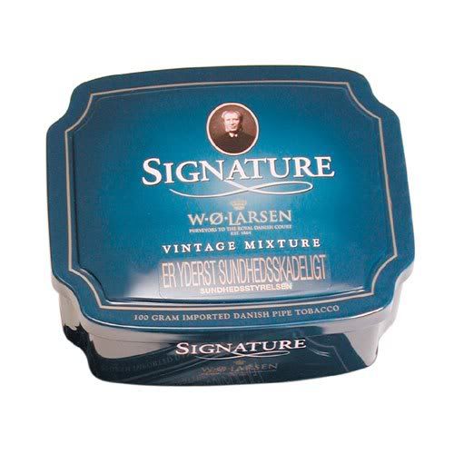


I'm wondering--what tobaccos do you all find to have the most attractive tin art or tin design? What tobaccos do you find to have particularly unattractive tins?
Personally, I love the tin designs of Squadron Leader and Grousemoor. And those Dan Tobacco tins with the American Revolution theme look pretty cool too. On the flip side... why can't RRR come in a tin that looks more like Marlin Flake? And why can't Mac Baren use capital letters?
Obviously, it's what's inside the tin that matters most. But I do appreciate a good design. And all things being equal, I'd prefer a beautiful tin to an ugly one.